Google
Roboto Flex
A highly adaptable variable family built around wide weight, width, grade, and optical-size control, designed to extend Roboto into modern screen and large-display workflows.
 aiChatGPT
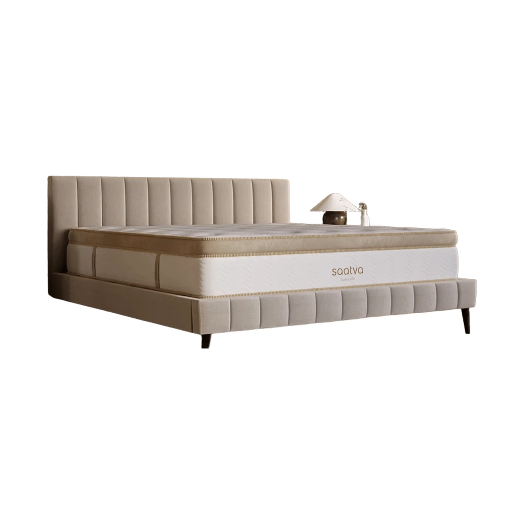 침대Saatva Classic Mattress
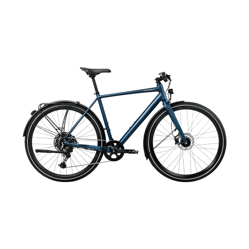 자전거Vector 15 EQ
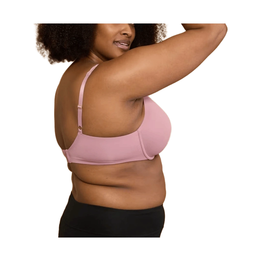 브라Pure Luxe Custom Coverage Contour Underwire Bra
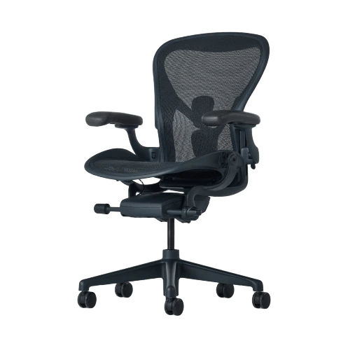 의자Aeron Chair
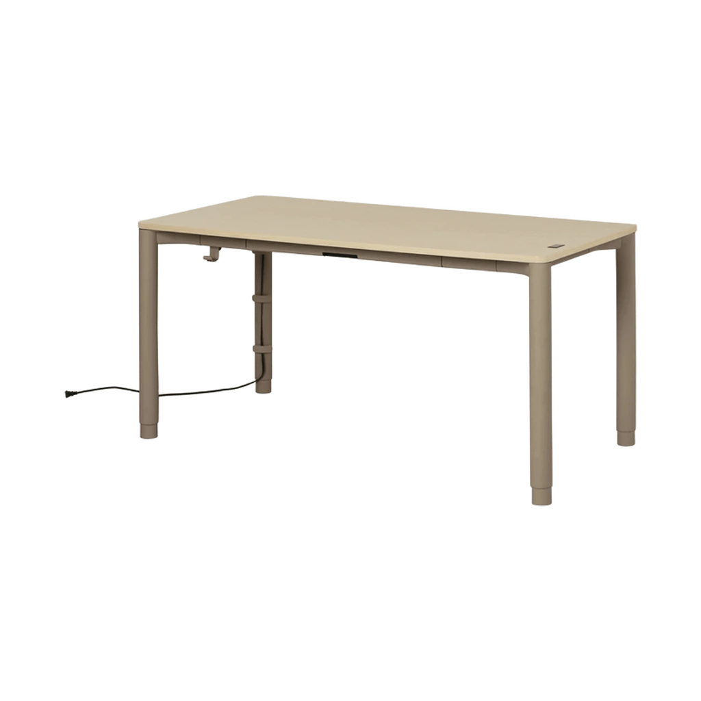 책상Spout Sit-to-Stand Table
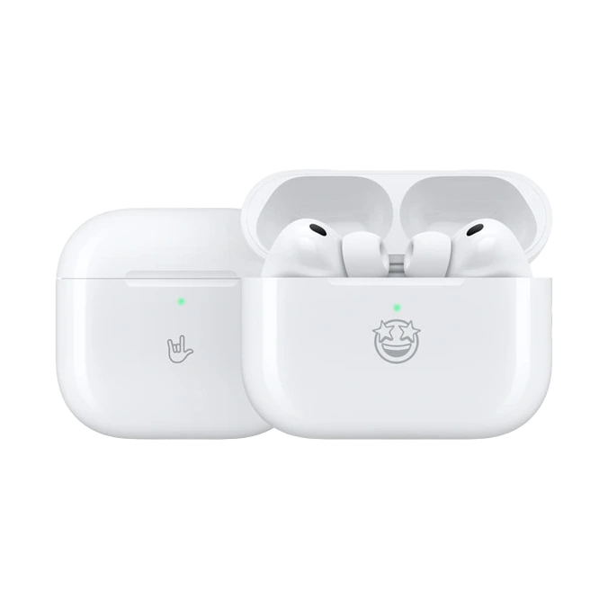 이어폰AirPods Pro 3
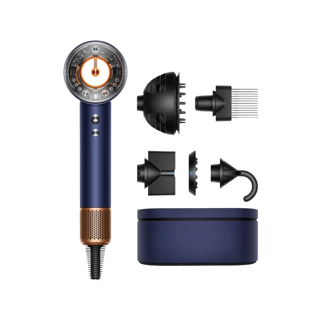 hairdryerSupersonic Nural
 헤드폰AirPods Max 2
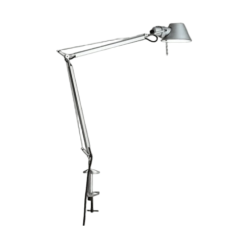 스탠드Tolomeo LED Mini Desk Lamp with Clamp
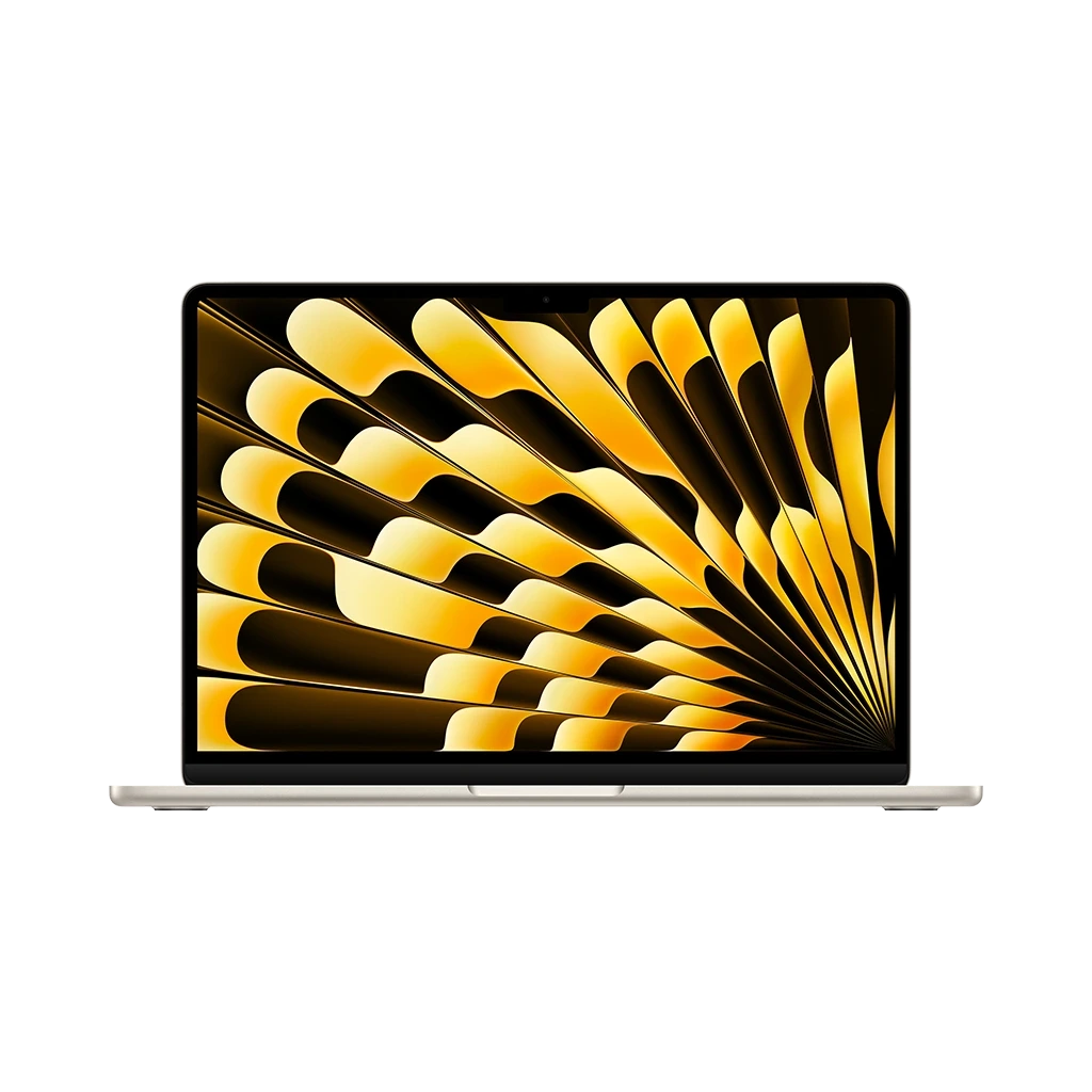 노트북MacBook Air with M5 (13-inch / 15-inch)
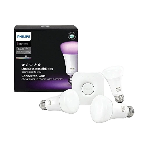 조명Philips Hue White and Color Ambiance A19 Starter Kit
 립밤Lip Therapy Original Stick
 노트Jibun Techo DAYs 2026 A5 slim Gray
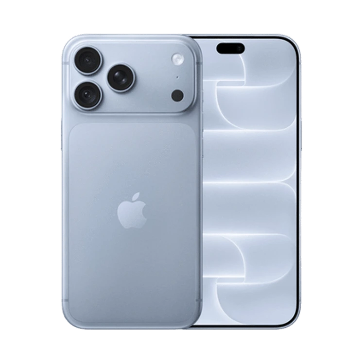 휴대폰iPhone 18 Pro Max
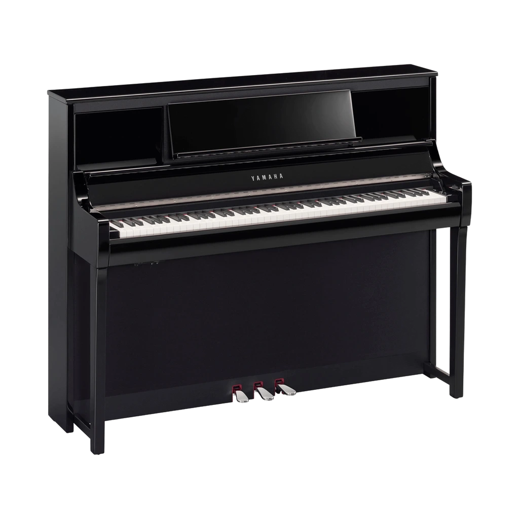 피아노Clavinova CSP-295
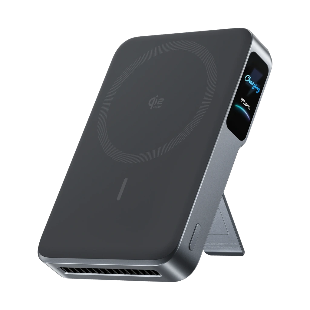 Power banksAnker MagGo Power Bank 2 Pro
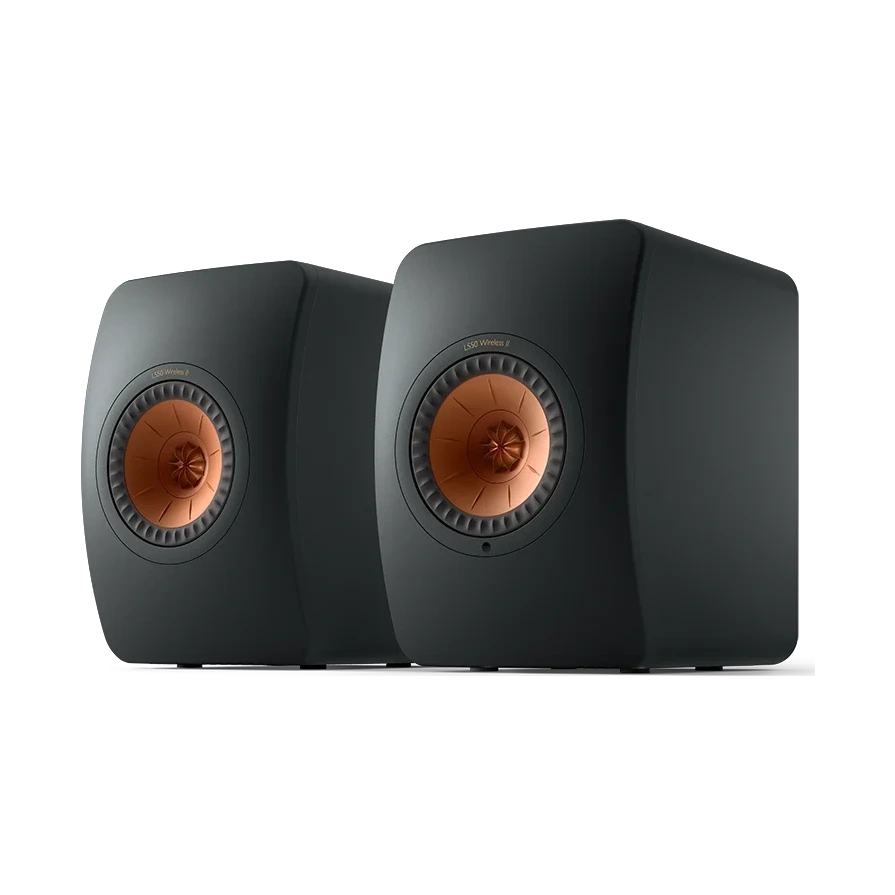 스피커LS50 Wireless II
A highly adaptable variable family built around wide weight, width, grade, and optical-size control, designed to extend Roboto into modern screen and large-display workflows.
Teams that need one family to cover dense UI text, scalable headings, and responsive large-screen typography with a single variable-font system.
The family’s strongest advantage is flexibility it is less of a neutral default and more of a tunable system that rewards careful design implementation.