Interfaces that want a coherent family system with a recognizable but restrained corporate tone, especially when sans, serif, and mono need to work together.
- Small-size legibility and spacing
- Google describes Plex Sans as having excellent legibility for print, web, and mobile interfaces, while Typographica and the usage example support its effectiveness in real UI/body-text settings. The evidence points to dependable small-size clarity without being as aggressively optimized as Roboto Flex.
- Hierarchy across UI sizes
- IBM Plex’s strength is the superfamily structure across Sans, Serif, and Mono, which supports role separation in interfaces. However, the available evidence is about family coherence rather than strong optical-size machinery, so hierarchy support is good but not exceptional.
- Implementation quality and rendering behavior
- The official specimen positions Plex as a practical font for multiple media, and Typographica characterizes the design as well judged and usable. Still, there is little evidence here of advanced variable-font or optical-size behavior, so it lands below Roboto Flex on implementation sophistication.
- Coverage and licensing practicality
- IBM Plex is openly available and intended for broad use, which makes deployment straightforward. Its superfamily structure helps practical system planning, but the retrieved evidence is not enough to claim superior multilingual breadth over the others.
Its strength is coherence and usability as a system family, not optical-size sophistication; the evidence also shows some ambiguity in real-world matching and usage documentation.
 aiChatGPT
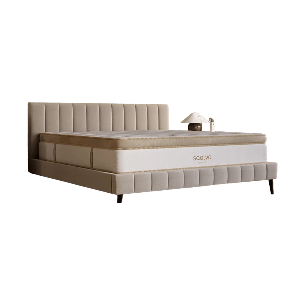 BedsSaatva Classic Mattress
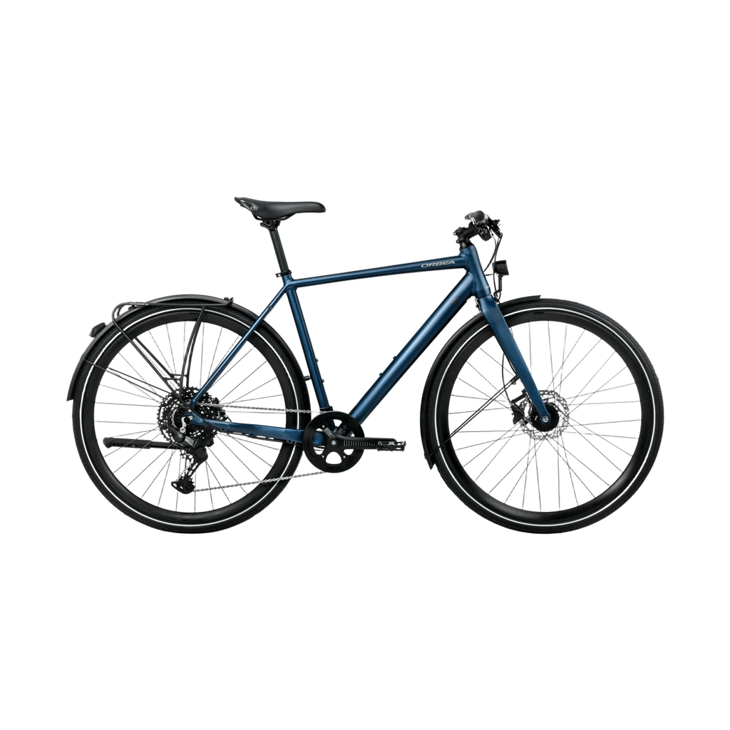 BicyclesVector 15 EQ
 BrasPure Luxe Custom Coverage Contour Underwire Bra
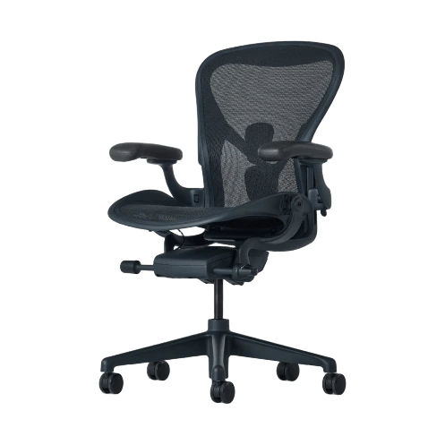 ChairsAeron Chair
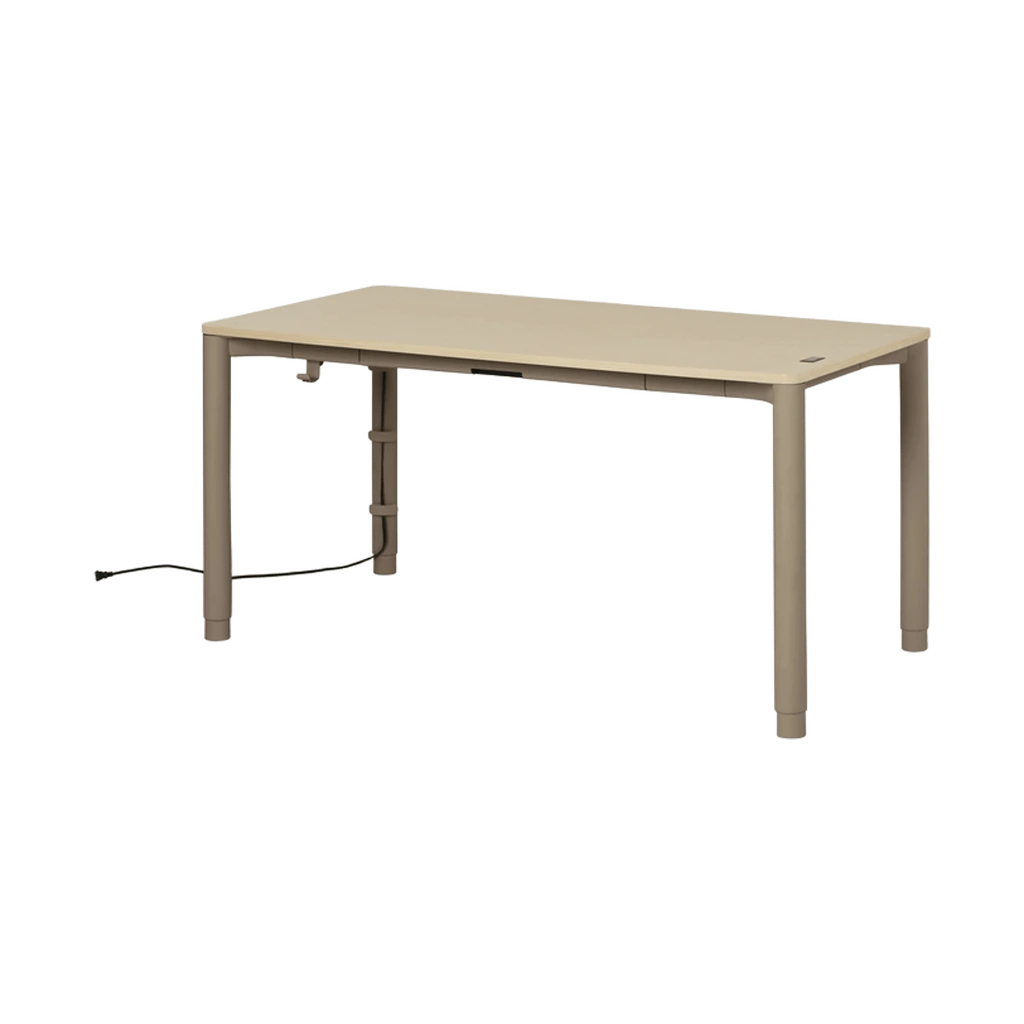 DesksSpout Sit-to-Stand Table
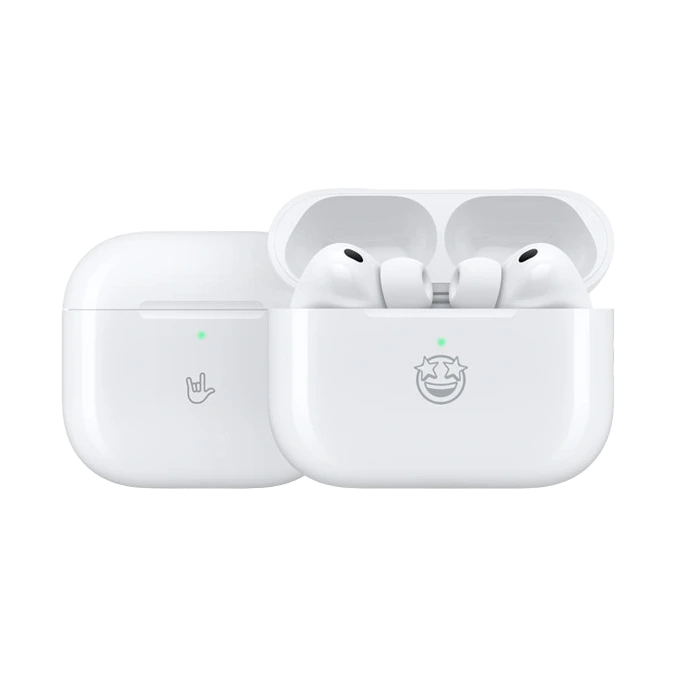 EarphonesAirPods Pro 3
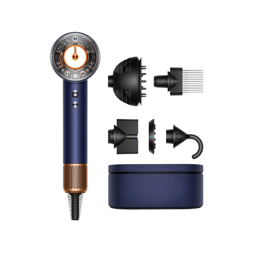 hairdryerSupersonic Nural
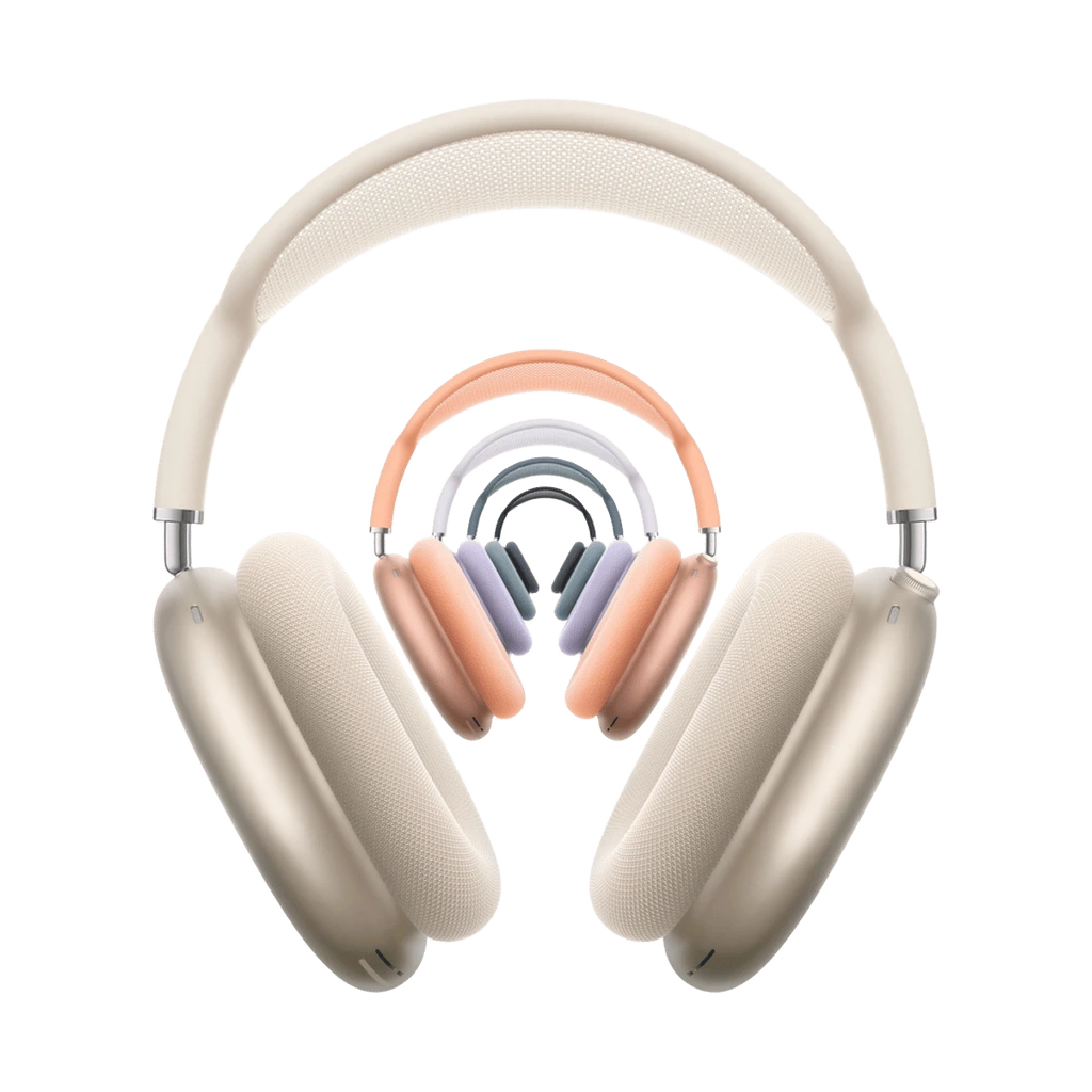 HeadphonesAirPods Max 2
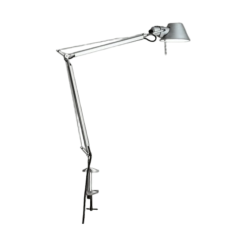 LampsTolomeo LED Mini Desk Lamp with Clamp
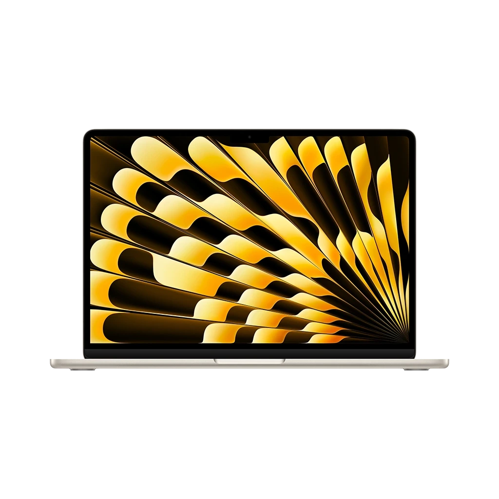 LaptopsMacBook Air with M5 (13-inch / 15-inch)
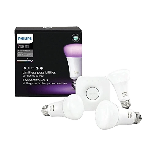 LightingPhilips Hue White and Color Ambiance A19 Starter Kit
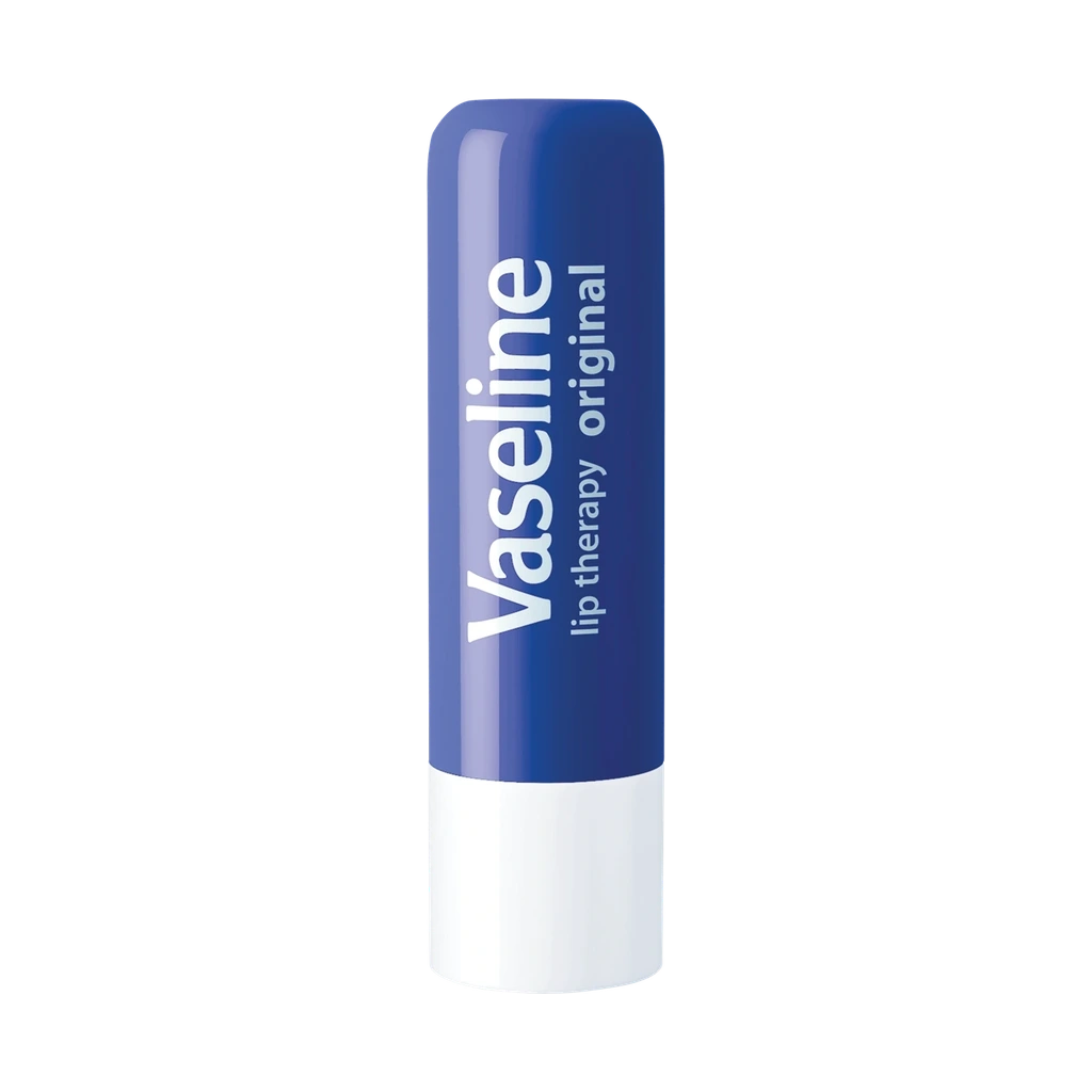 Lip balmLip Therapy Original Stick
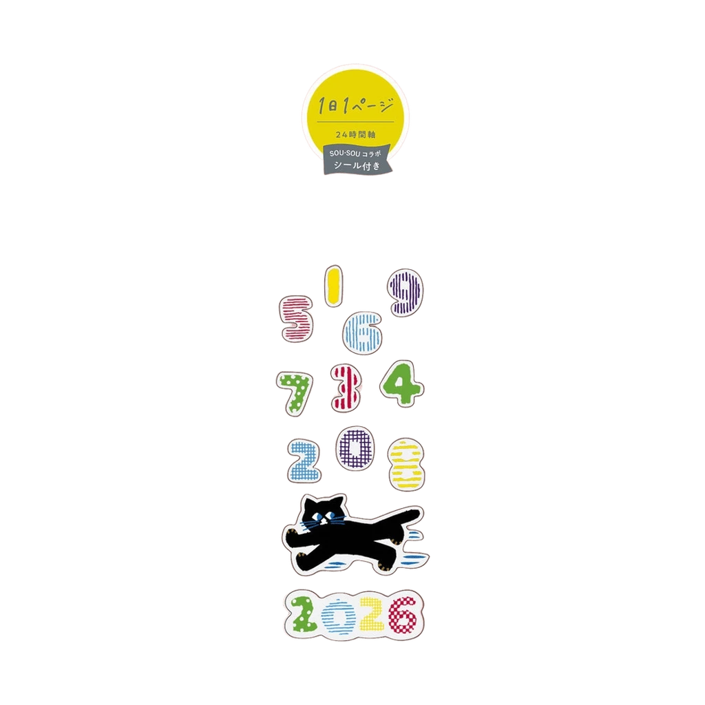 NotebooksJibun Techo DAYs 2026 A5 slim Gray
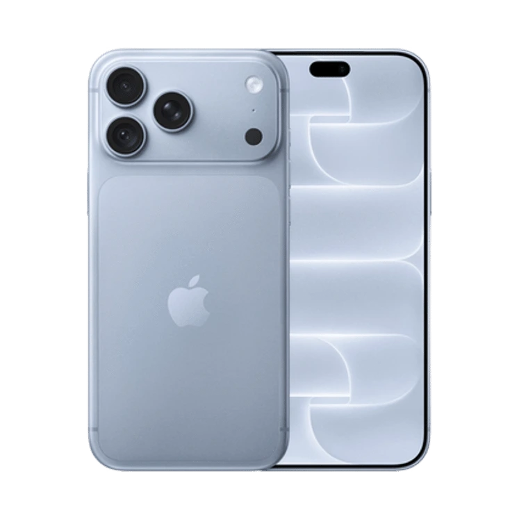 PhonesiPhone 18 Pro Max
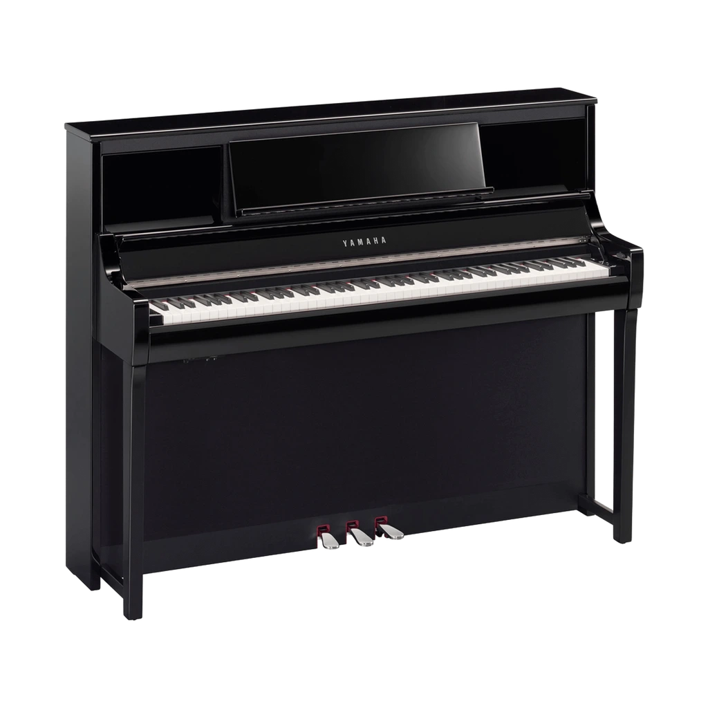 PianosClavinova CSP-295
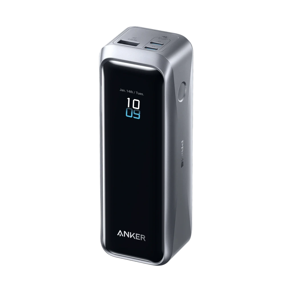 Power banksAnker Prime Power Bank (20K, 220W)
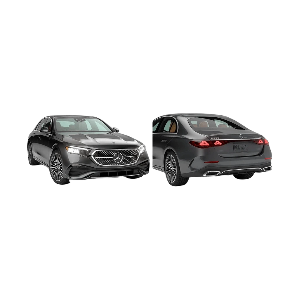 SedansE-Class Sedan
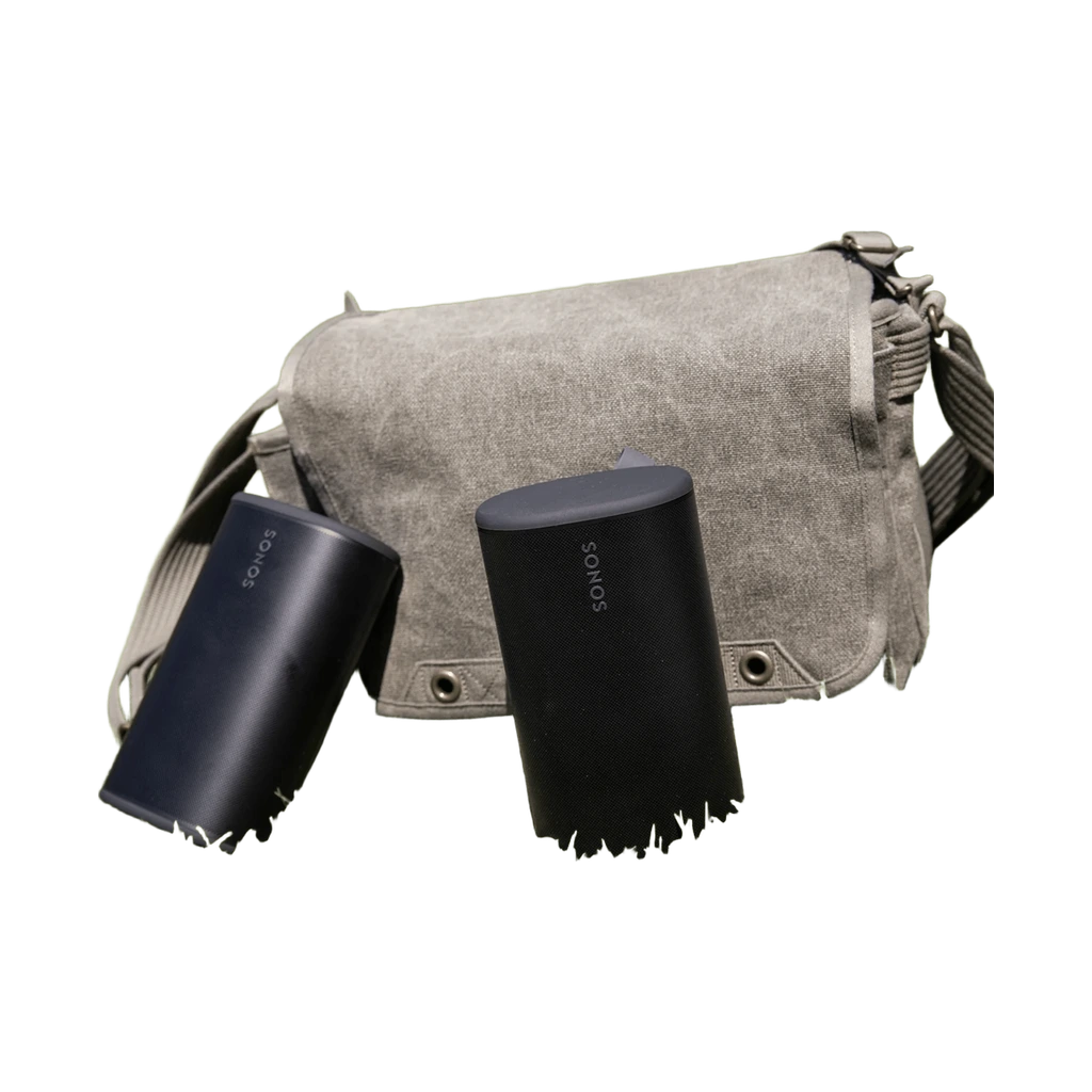 SpeakersSonos Play